This lesson will cover:
1 The responsive layout
2 New CSS code
3 An example responsive page (CSS & HTML)
At the bottom of this page there is a code editor pre-loaded with the
lesson's code.
Responsive Layout
Using <div> elements, we will organize the <body> into rows and columns
Rows take up horizontal space.
AND
Columns take up Vertical space.
Have you ever used Excel? Rows and columns work the same way
Columns:
1st We will divide the screen into 12 equal columns.
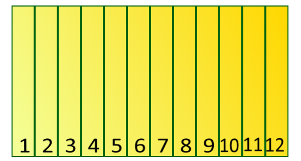
2nd We will create 12 clssses, each for a different column widith.
- "col-1" will be 1/12 of the screen width
- "col-2" will be 2/12 of the screen width
- and so on...
- class = "col-12" will be 12/12(entire screen width)
Rows:
3rd We will define row class:
- Rows are horizontal portions of the screen.
- Row Width = avilable width of parent container
Layouts:
4th We will make a layout:
- Layouts combine rows and columns
- They create the basic design of the page
New CSS Code
Box-sizing:
Box-sizing defines what
is included in an element's height and width. Possible values include:
1 content-box:
- Default Setting
- Includes Content Only
- Does Not Include: Margins, Padding, Borders
2 border-box
- box-sizing: border-box;
- Includes: Content, Padding, Borders
- Does Not Include: Margins
For our responsive layout, we will make box-sizing for ALL of our elements border-box. See the
code below.
      * {
        box-sizing: border-box;
      }
*= Attribute Selector
*= is used to apply CSS code to elements the contain a particular value
in the attribute. We are going to use
*= to define the column width on small
devices. All our column classes will start with "col-".
Small Devices "col-" classes (i.e. cell phones):
- Are defined before large devices
- Are all equal width
- Width = 100%
    /* For Small Devices*/
    [class*="col-"] {
        width: 100%;
    }
Media Query:
A media query (
@media) allows you to apply conditions to your CSS code. That means
different CSS code will execute depending on the situation.
We will use media querries to apply a block of CSS code to
large devices (i.e. computers).
- Large devices have a screen width of at least 768px.
- Large device media querry:
@media only screen and (min-width: 768px) {
  /* Code goes here*/
}
- Media querry for small devices:
@media only screen and (max-width: 768px) {
  /* Code goes here*/
}
To define columns ("col-") for large devices, we first have to cut the screen into 12
equal parts. Then we will make a column class for each of 12 possible sizes.
- The total width of the screen is 100%
- We are cutting the screen into 12 columns
- 100 ÷ 12 = 8 1/3 or aproximately 8.33
CSS: Large Devices
  /* For Large Devices*/
  @media only screen and (min-width: 768px) {
      .col-1  {width: 8.33%;}
      .col-2  {width: 16.66%;}
      .col-3  {width: 25%;}
      .col-4  {width: 33.33%;}
      .col-5  {width: 41.66%;}
      .col-6  {width: 50%;}
      .col-7  {width: 58.33%;}
      .col-8  {width: 66.66%;}
      .col-9  {width: 75%;}
      .col-10 {width: 83.33%;}
      .col-11 {width: 91.66%;}
      .col-12 {width: 100%;}
  }
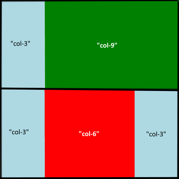
In our example responsive page we are only using the 2 sizes. However, you
may want to include more screen size media querries. For example, you may want code for a
medium device, like a tablet. See the code below.
CSS for medium devices:
  /* Tablets: */
  @media only screen and (min-width: 600px) {
    .col-t-1 {width: 8.33%;}
    .col-t-2 {width: 16.66%;}
    .col-t-3 {width: 25%;}
    .col-t-4 {width: 33.33%;}
    .col-t-5 {width: 41.66%;}
    .col-t-6 {width: 50%;}
    .col-t-7 {width: 58.33%;}
    .col-t-8 {width: 66.66%;}
    .col-t-9 {width: 75%;}
    .col-t-10 {width: 83.33%;}
    .col-t-11 {width: 91.66%;}
    .col-t-12 {width: 100%;}
}
HTML Examples
<div class="col-3 col-t-3"></div>
<div class="col-3 col-t-6"></div>
::after Selector
- Syntax- ::after
- Inserts something after the element's content
- Use content:" "; to insert content after
For our responsive row class, we will use ::after.
.row::after {
    content: "";
    clear: both;
    display: table;
}
Table Display
- Syntax- display: table;
- Displays like a table element
- Table elements display as columns & rows
For our responsive row class, we will use display: table; in
our .row::after code block.
.row::after {
    content: "";
    clear: both;
    display: table;
}